
Samh – Toadstool
The Toadstool cover depicts Samh in a dynamic action shot. Rendered in a cartoon style using Blender 3D software, Sam flies through a swirling vortex of vibrant reds and purples, representing the danger and wonder of an interdimensional journey. His expression is a mix of excitement and determination. Floating around him are elements created in Adobe Illustrator: a white rabbit (a nod to Alice in Wonderland), scattered playing cards (symbolizing the unpredictable nature of his travel), toadstools of various shapes and sizes (referencing the song title), and even his trusty guitar – a constant companion in this strange new world. Lens flares and a black background emphasize the speed and focus on Sam, while swirling nebulae could be added for an extra interdimensional touch.

Slinki – ANX BNX
The single artwork for “ANX BNX” was created to capture the energy and intensity of the song. The vibrant pink background and the blue ribbon represent motion and movement, while the image of Slinki and his doppelgangers flipping and twisting acrobatically in the air captures the essence of “tricking,” a sport that embodies the song’s powerful beat and rhythmic structure. The artwork also features various iterations of the ribbon, which symbolize the song’s versatility and ability to evolve and change over time.

Bobbino – Little Ambient Side Project vol.1
The single artwork for “Little Ambient Side Project vol.1” was created to capture the tranquility and introspective nature of the music. The limited palette of dark colors and pink stars creates a sense of mystery and depth, while the archway serves as a gateway into an alien and otherworldly realm. The pink line work breaks up the image and allows elements to flow around the cover, adding a sense of fluidity and movement. The inclusion of characters representing the rise and fall of an artist suggests the cyclical nature of creation and destruction, while also mirroring the ebb and flow of the music. Overall, the artwork is a fitting representation of the EP’s ambient soundscape and its exploration of themes of self-discovery and transformation.

Samh – Fat Of The Apple
The single artwork for “Fat Of The Apple” was created to capture the album’s themes of connection to nature and the hidden power of Mother Nature. The illustration by Katie Allen Gabe depicts a whimsical scene of woodland creatures frolicking in an autumnal landscape, while the artworking by myself adds a touch of magic and mystery. The artwork is used in posters, merchandise, and an augmented reality experience, all designed to enhance the album’s immersive and nature-inspired experience.
The artwork’s autumnal colors evoke a sense of warmth and rejuvenation, while the hidden figures of Mother Nature in the hills represent the unseen forces that govern nature and the universe. The overall design is a celebration of the beauty and wonder of nature, while also hinting at the deeper connections that exist between humans and the natural world.

Zoey Brook Jackson – Cabaret
Overall, the artwork is a fitting representation of the song’s theatricality and its exploration of themes of identity and self-discovery. It is a captivating and visually striking piece that perfectly captures the essence of Zoey Brook Jackson’s music.

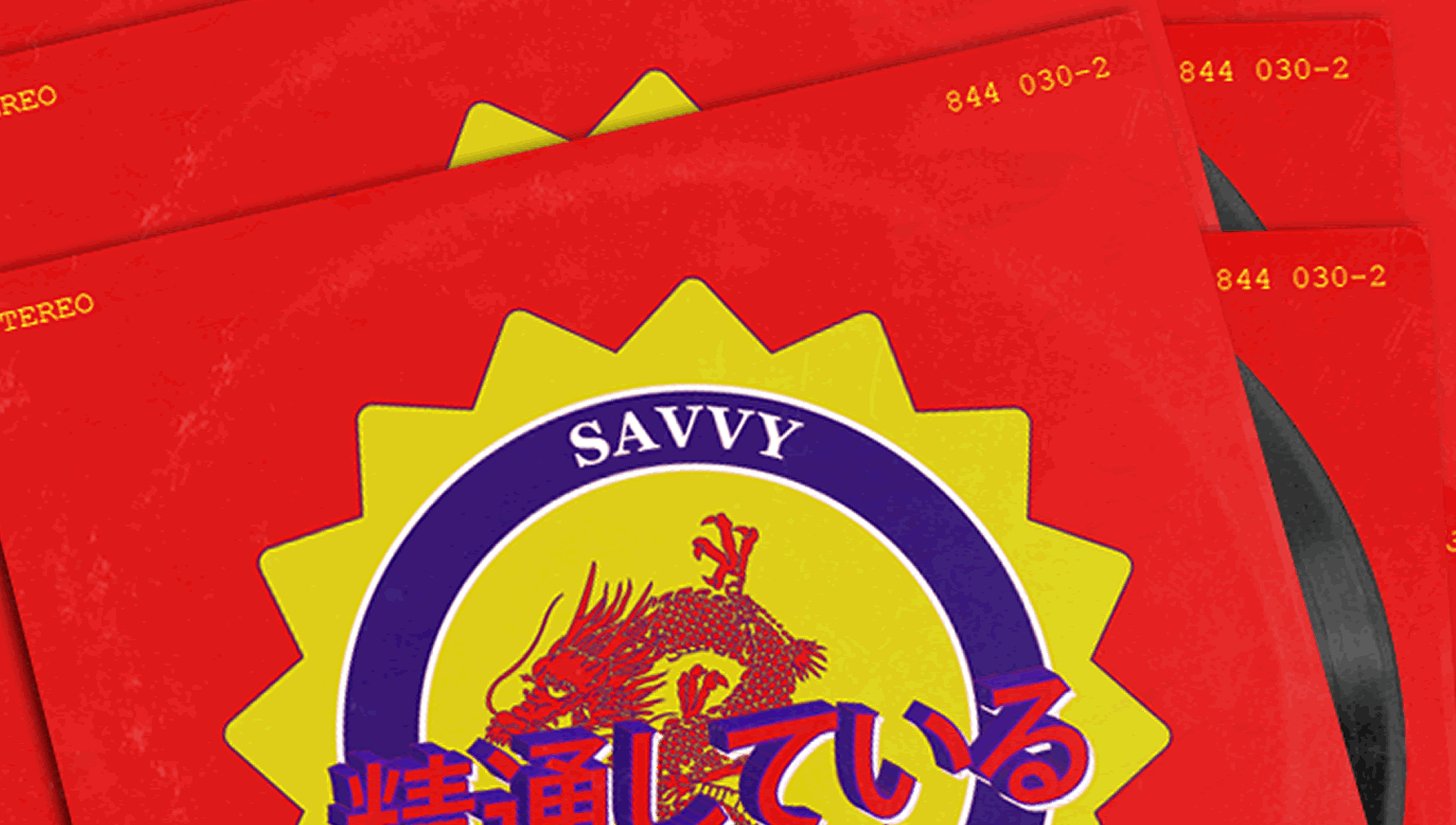
Savvy – In The Pursuit Of…
The artwork for the single “In the Pursuit of” features a dark background, a baby (which represents humanity) in front of a TV, and hands reaching out through the screen. This imagery is meant to represent the corrupting influence of media on society. The black and white color scheme is meant to represent the polarizing nature of media and the absolute positions people take based on what they watch.
Overall, the artwork is a powerful and thought-provoking representation of the song’s themes of media manipulation and the dangers of unchecked consumption of information.

Savvy – The Only Way I Know
The single artwork for “The Only Way I Know” was created to capture the artist’s introspective and thoughtful nature. The black and white image, with Savvy’s pensive expression, is meant to reflect the contemplation that precedes the release of the song. Savvy’s singular image could represent the juxtaposition of vulnerability and strength, alluding to the emotional depths of the music and the rapper’s willingness to be vulnerable with his audience. Acknowledging the enormity of the task that is about to be undertaken, the artwork conveys the weight of the artist’s message and the sincerity with which it is being delivered.

Savvy – The Hour Of The Wolf
The single artwork for “The Hour of the Wolf” was created to capture the artist’s bold and assertive style, as well as the intensity of the song. Savvy’s wolf mask, a nod to old school hip hop, is superimposed on a vibrant pink glow, which represents the song’s energy and power. The gold chain around the wolf’s neck adds a touch of luxury and sophistication to the image, while the bold typography conveys the strength and resilience of the artist.
The artwork as a whole represents the artist’s reclaiming of his identity and his place in the hip hop world. He is no longer afraid to be himself, and he is ready to take on the world. The wolf mask represents his inner strength and power, while the pink glow represents his passion and ambition. The gold chain represents his achievement and success.

Lisa Luxx – Girl Gang
The single artwork for “Girl Gang” by Lisa Luxx was created to capture the song’s themes of sisterhood, solidarity, and the power of female friendship. The black background, symmetry, roughness, and finger prints on photos create a sense of intimacy and authenticity, while the use of grain for an aged feel adds a touch of nostalgia and history. The photobooth style images of Lisa and her friends, with different races and skin tones, represent the diversity and inclusivity of sisterhood.
The artwork is a powerful and visually appealing representation of the song’s message, and it is sure to resonate with listeners who value the importance of female friendship and the strength of sisterhood.